


3 Cognitive Biases Hindering Your Design Process
August 28, 2025
We're all biased. You are too.
Your mind is super powerful, but sometimes it does funny things. Such as biases.
In case you don’t know what a bias is, Wikipedia describes it as the following:
A bias is basically you thinking more favorably of one option than of the other for no specific reason.
"I like option A more because it just feels better."
That’s a bias in a nutshell.
And let's be honest, we're all biased in some form.
Cognitive biases are possibly one of the biggest obstacles designers face when designing a page, because they cause us to not be able to look at our design with an objective eye, often without us even realising it.
Now, don't get me wrong, you're not a bad designer if you fall for these biases sometimes. Everyone does from time to time, it's a natural way of thinking. As long as you are aware of them.
Bias #1: "You know too much about it, so you can't explain it to a 4-year old "

Perhaps one of the most common obstacles that not only designers but anyone working on a website runs into, is the Curse of Knowledge (insert spooky music here). This is the idea that, because of your thorough knowledge on the subject, you can no longer view the page through the eyes of an ordinary visitor.
This can come both from the subject of the page or from the design itself. Things that seem obvious or natural to you may not feel that way to your visitors, and these holes in your design can be hard to spot. And if a page doesn't make sense to a visitor, they likely won't convert. Sure, you could use techniques like mouse tracking or user tests to find them once the page is live, but wouldn't it be so much faster and easier if another expert could quickly look along with you to find these issues?
Bias #2: "It's shiny and new, so it must be good!"
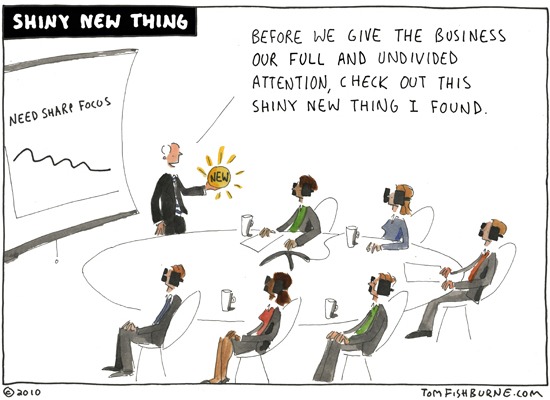
Or how about the pro-innovation bias and the system justification bias?
The pro-innovation bias is basically wanting to innovate for innovation's sake. This is wanting to do something new for no real reason other than that it's new.
You may have guessed, but the system justification bias is the exact opposite. This is the idea of wanting to stick to the old way for no other reason than that's how it's always been.
I have to admit I see this one less often with designers, but marketers and especially business owners do tend to fall for this one. They follow what's new and shiny or what's familiar and trusted, and this causes them to overlook that there may still be some opportunities for improvement left. I've run many a/b tests on shiny sites that clearly showed shiny wasn’t always the best. Always be on the lookout for this one. Be innovative, be unique, but don't reinvent the wheel.
Bias #3: "I know this will work because I made it!"
And let's not forget what's arguably the most dangerous one: the confirmation bias. This one is quite simple: you are typically more likely to like your own design.
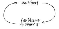
After all, you put a lot of work in it, it's your vision, it's very possible you may be a bit biased towards it. That may cause you to not look at it with a clear vision.
This doesn't have to be just because you like your design either. Designing takes a lot of time. Simply looking at your design for so long can cause you to miss small mistakes, which could end up costing you a lot of conversions. Remember the 'check' from our ARCTIC model?
It happens to everyone, and that's okay
There many more cognitive biases (check this list on Wikipedia) out there, but these are just some of the ones I see myself and others running into most often. And let me stress again, it's OK to run into these biases. Especially in my early days I've had it happen plenty of times that I made a design I loved, and I was convinced it would perform great, only for it to fail big time when I a/b tested it due to some issues I didn't see because of these biases.
The solution? Get feedback from someone else
Above all, you should always be as critical as you can with your judgment, but it's always possible something will slip through. That's why it's so incredibly valuable to have someone else take an extra look at your design. They could offer a neutral view, not influenced by knowledge about the product or involvement in the design or something like that. But understandably, you'd want someone with knowledge of landing page design to judge your landing page, and finding a landing page designer you don't know that is willing to take an unbiased look at your landing page to help you improve it as much as possible, is admittedly quite hard. If you can't find someone, try our new landing page review service.
I honestly always recommend asking someone else to take a look at your design before you put it live. It doesn't matter who, any extra pair of eyes can offer valuable info. But nobody can quite find the nitty-gritty details like another, unbiased, experienced designer. Two are better than one, right?